
Featured project
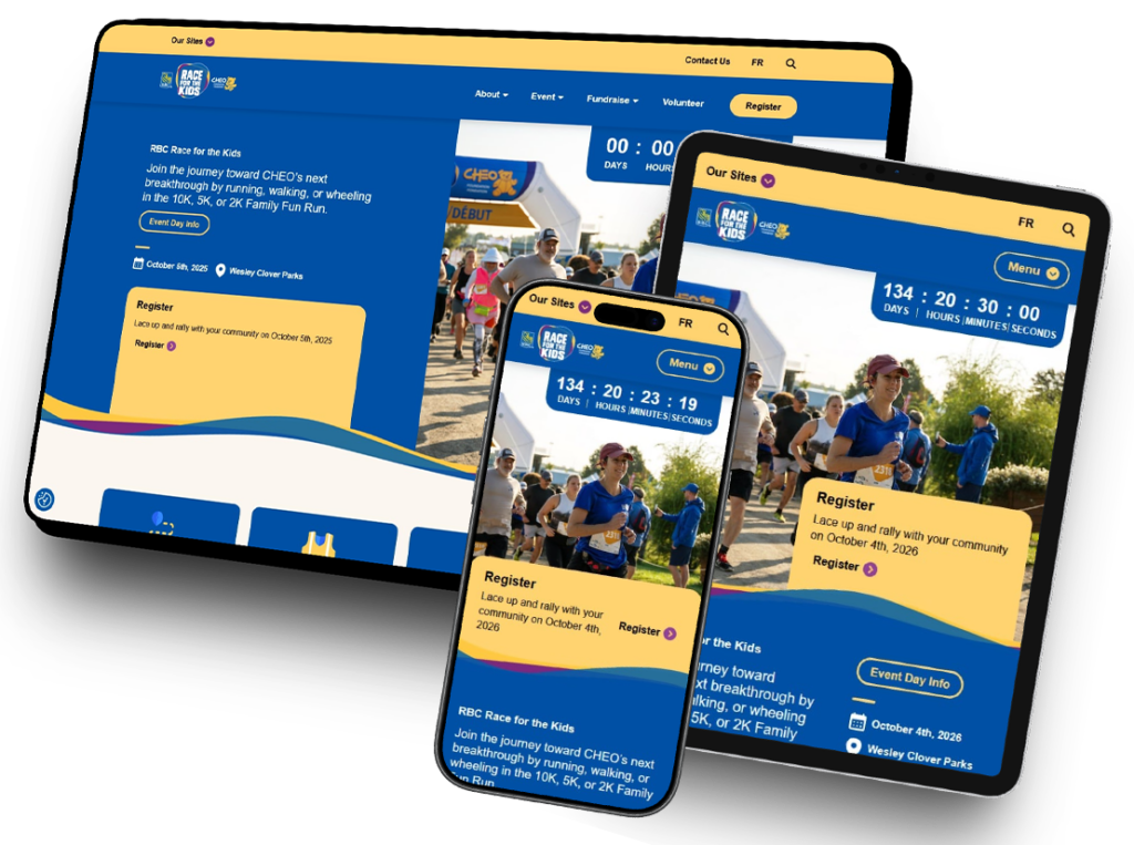
RBC Race for the Kids
The RBC Race for the Kids website was one of the most visually ambitious and technically challenging projects within the larger CHEO ecosystem, and that I’ve ever had the pleasure of working on. Built to support one of CHEO Foundation’s largest fundraising initiatives, the site combined highly dynamic layouts, layered imagery, interactive components, and complex Gutenberg-driven responsive systems.
Challenges & Solutions
Advanced Gutenberg Layout Engineering
One of the biggest challenges of this project was recreating highly custom visual layouts entirely within Gutenberg — without relying on traditional pseudo-elements or absolute-positioned overlays.
The site made extensive use of:
- Ribbon-style section dividers
- Vertical and horizontal swoop transitions
- Extreme one-sided border radius effects
- Overlapping imagery
- Decorative background treatments
- Asymmetrical layouts
Many of these layouts required carefully structured nested Gutenberg blocks, negative spacing systems, layered cover blocks, and extensive responsive refinements to ensure layouts remained cohesive across all devices.
Dynamic Hero Banner Systems
The site featured multiple hero banner variations that changed significantly from page to page.
Some layouts included:
- 50/50 split-screen heroes
- Countdown timers
- Registration callout boxes
- Full-width imagery with gradient overlays
- Ribbon integrations
- Dynamic content alignment
Each hero variation required its own responsive behavior while still maintaining consistency with the overall design system.
Complex Button Architecture
The button system for the site became one of the most technically involved components of the entire project.
Because button styles varied depending on section backgrounds, hover states, border visibility, and accessibility requirements, I developed a structured system that controlled:
- Background inheritance
- Hover and focus states
- Transparent button variations
- Border visibility behavior
- Accessibility color contrast
- Dynamic color pairings
This process became so complex that I created a dedicated spreadsheet system to map button behavior and pseudo-state styling across the entire platform.
Complex Interactive Components & Layered Imagery
The project also relied heavily on decorative imagery systems including:
- Color “blob” image backgrounds
- Ribbon image treatments and decorative section transitions
- Overlapping cutout photography + images extending beyond section boundaries
- Responsive donation thermometers
Balancing responsiveness, accessibility, and editorial flexibility across these components required extensive front-end refinement throughout development.
Additional interactive systems throughout the platform included:
- Advanced FAQ filtering systems
- Deeply nested responsive table layouts
- Multi-column Gutenberg structures
- Countdown integrations
- Dynamic fundraising content blocks
The Final Result
Bold visuals.
Thoughtful implementation.
From custom ribbon dividers and asymmetrical section transitions to highly customized hero banners and advanced button styling logic, nearly every aspect of the project required creative problem-solving and thoughtful front-end engineering.
What began as one of the most visually ambitious projects within the CHEO ecosystem evolved into a polished and scalable fundraising experience — giving CHEO staff the flexibility to confidently manage, expand, and evolve the platform long after launch, and a gorgeous website that can be re-purposed year after year.