
Featured project
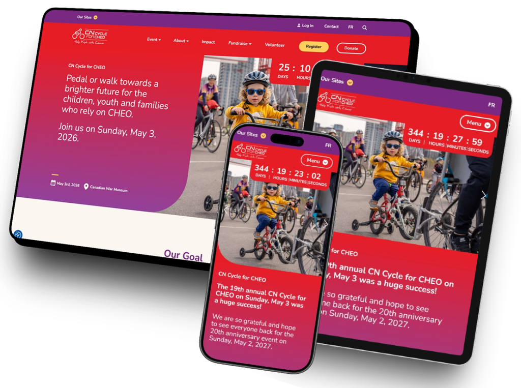
CN Cycle for CHEO
The CN Cycle website supported one of CHEO Foundation’s largest annual fundraising and community events, requiring a highly engaging and informative digital experience capable of supporting participants, route information, sponsors, fundraising efforts, and event updates.
Challenges & Solutions
Responsive Gutenberg Reconstruction
Many layouts throughout the project relied on deeply nested Gutenberg structures. To support this complex architecture, I developed and styled systems for elements including:
- Columns inside columns
- Layered cover blocks
- Dynamic content sections
- Responsive image treatments
- Interactive overlays
- Decorative gradient divider systems
Because many sections were initially designed primarily for desktop layouts, significant restructuring and refinement was required to ensure cohesive responsive behavior across tablet and mobile devices.
One particularly challenging element involved decorative vertical gradient column separators that originally relied on static imagery, which created several responsive and alignment issues. As a solution, I used narrow Gutenberg cover blocks with gradient overlays to replace these images, allowing the separators to remain fully responsive while consistently aligning across columns regardless of content length or layout variations.
Sticky Subnavigation System
Interior pages featured a secondary navigation menu positioned beneath the hero banner that needed to function independently from the primary site navigation.
During development, I took the initiative to expand the functionality of this subnavigation system — particularly from an accessibility and usability standpoint — recognizing how important it would be for users to easily navigate between related pages within the same section without excessive scrolling.
This enhanced functionality included:
- Sticky positioning during scroll
- Independent mobile behavior
- Responsive styling
- Accessible keyboard functionality
- Mobile menu integration
These interior page menus became one of the more technically involved navigation systems across the CHEO ecosystem.
Countdown Timer & Translation Support
One of the more unique challenges involved developing a fully responsive and translatable countdown timer system.
The component needed to:
- Remain responsive across devices
- Support both English and French translations
- Maintain alignment consistency
- Adapt to changing content lengths
- Preserve accessibility and readability
Custom responsive styling systems were developed to ensure both languages remained visually balanced throughout the experience.
Third-Party Event & Route Integrations
The project also required integrating with third-party mapping and route plugins to support cycling route details and participant information.
Additional interactive components included:
- Hover-overlay Gutenberg cards
- Responsive sponsor sections
- Dynamic route displays
- Swiper-based image sliders with text overlays
- Interactive fundraising sections
The Final Result
Built for movement.
Designed to perform.
With deeply nested Gutenberg structures, interactive event and route integrations, and highly customized responsive layouts, this project required balancing accessibility, usability, and editorial flexibility across a wide range of devices and screen sizes.
The completed site delivered a polished and accessible fundraising experience capable of supporting participants, sponsors, and event organizers through one of CHEO’s largest community-driven initiatives.