
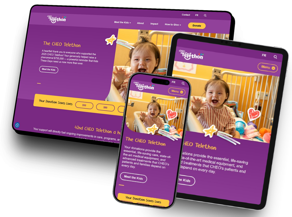
Featured project
The CHEO Telethon
The CHEO Telethon website was designed to support one of the organization’s annual fundraising campaigns through storytelling, donor engagement, and highly visual content presentation.
The project combined layered graphics, interactive content systems, reusable Gutenberg components, and complex responsive layouts — all while ensuring accessibility and translation support across the platform.
Challenges & Solutions
Responsive “Sticker” Systems
One of the most unique challenges throughout the project involved the decorative “sticker” graphics layered throughout the site.
Because every sticker image varied dramatically in size, shape, and orientation, creating a consistent placement system became highly complex — especially when ensuring content never became obscured by overlapping graphics.
Additional considerations included:
- Responsive scaling
- Translation support
- Section overlap behavior
- Layering hierarchy
- Mobile spacing adjustments
Creating a reusable system that functioned consistently across multiple templates required extensive front-end experimentation and refinement.
Interactive Hover Overlay Components
The project featured large interactive content cards with:
Since interactive states of these elements were not included in the original Figma designs, I developed consistent hover, focus, and accessibility behaviors across:
- Overlay content reveals
- Animated underline treatments
- Expanding hover states
- Icon animations
- Responsive transitions
These interactions needed to remain visually engaging while still maintaining accessibility and usability across devices.
Layered Border & Image Treatments
Many image sections throughout the site relied on oversized decorative border systems and layered content framing.
To recreate these effects within Gutenberg, I used combinations of:
- Nested cover blocks
- Layered content wrappers
- Background color layer containers
- Responsive spacing systems
This allowed highly stylized visual treatments to remain editable and maintainable within the WordPress editor.
Reusable Query Loop Systems
Because the “Kids Stories” custom post type appeared throughout multiple pages and layouts, I implemented reusable Query Loop and Pattern systems that allowed editorial teams to dynamically surface content throughout the site without requiring custom page construction each time.
This improved:
- Content scalability
- Editorial flexibility
- Consistency across templates
- Long-term maintainability
The Final Result
Story-driven design.
Built with flexibility.
From overlapping sticker graphics to interactive content systems and reusable Gutenberg patterns, every section of the platform was designed to balance creativity, responsiveness, and long-term maintainability.
The final experience delivered an engaging and accessible fundraising platform that allowed CHEO staff to confidently manage and expand content while continuing to support one of the organization’s annual campaigns.